Overview
Assignment: Perform a full case study, from user interviews to UI design, for a subject I’m passionate about: biking and better transportation. For a link to the working prototype or other questions, please contact me.
Welcome screen mockup
Video of bici prototype in action

So why bikes?
Well, first off, bikes are cool. But they’re also
Well, first off, bikes are cool. But they’re also
— good for the environment
— good for you
— and cheap! (compared to car ownership)
— good for you
— and cheap! (compared to car ownership)
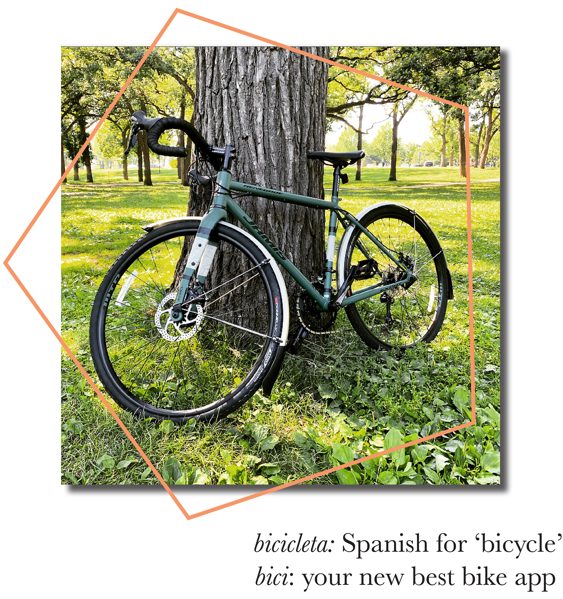
My bike and app inspiration
So if they’re so great, why aren’t more people riding them?
My hypothesis:
— biking can feel unsafe, which doesn’t lead to the best incentive to go for a ride
— and if there is a way to make bikes safer, people who already are enthusiasts will feel bike even more
— and if there is a way to make bikes safer, people who already are enthusiasts will feel bike even more

The research
User interviews revealed some interesting findings. Bikers, by and large
— are big planners; biking takes preparation
— prefer to bike unless weather or time prevents them
— are super aware of their surroundings and take notice when something screws with their routes
— prefer to bike unless weather or time prevents them
— are super aware of their surroundings and take notice when something screws with their routes
*Thank you Alex, Evan, Cole, Anna, and Linda.
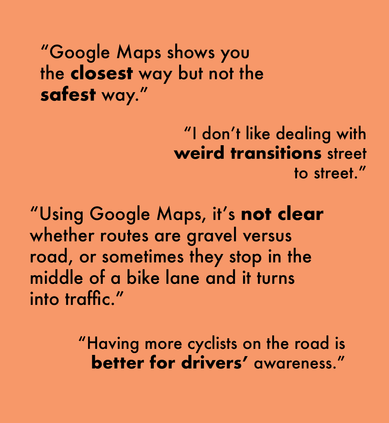
User interview snippets
This led to a change in my hypothesis. It became
— biking can be made safer with accurate routes that avoid biking-specific safety issues
— hopefully, feeling safer will lead to increased bicycle use
— hopefully, feeling safer will lead to increased bicycle use

Competitive analysis was performed and a persona created based on interviews and findings.
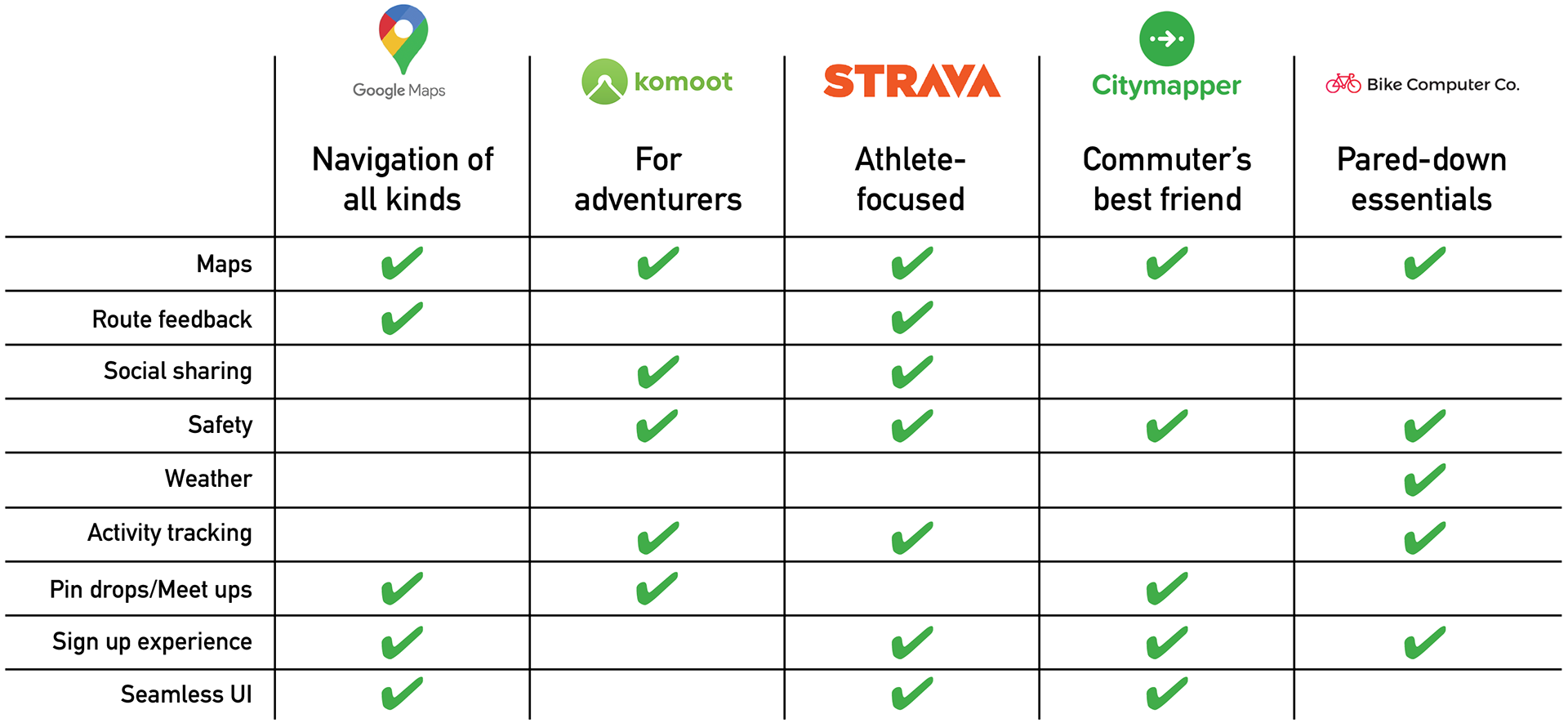
Competitive analysis for bici
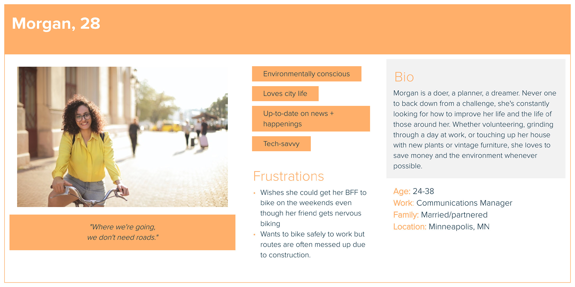
User profile for bici

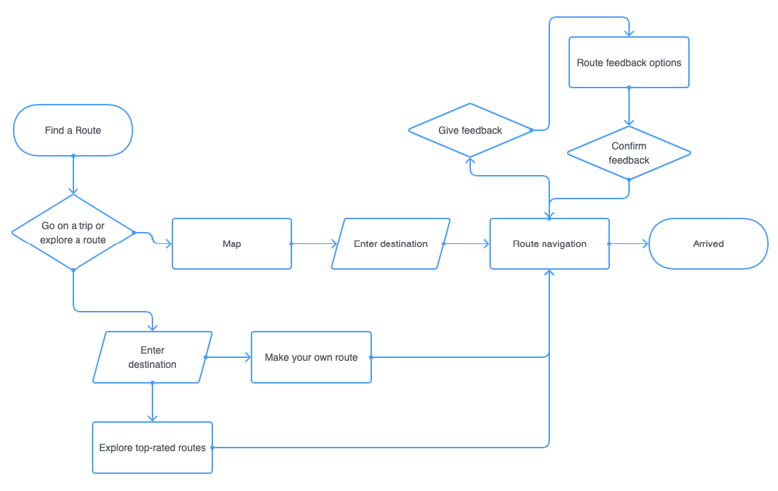
An initial user flow from early planning
The must-haves were few, but important:
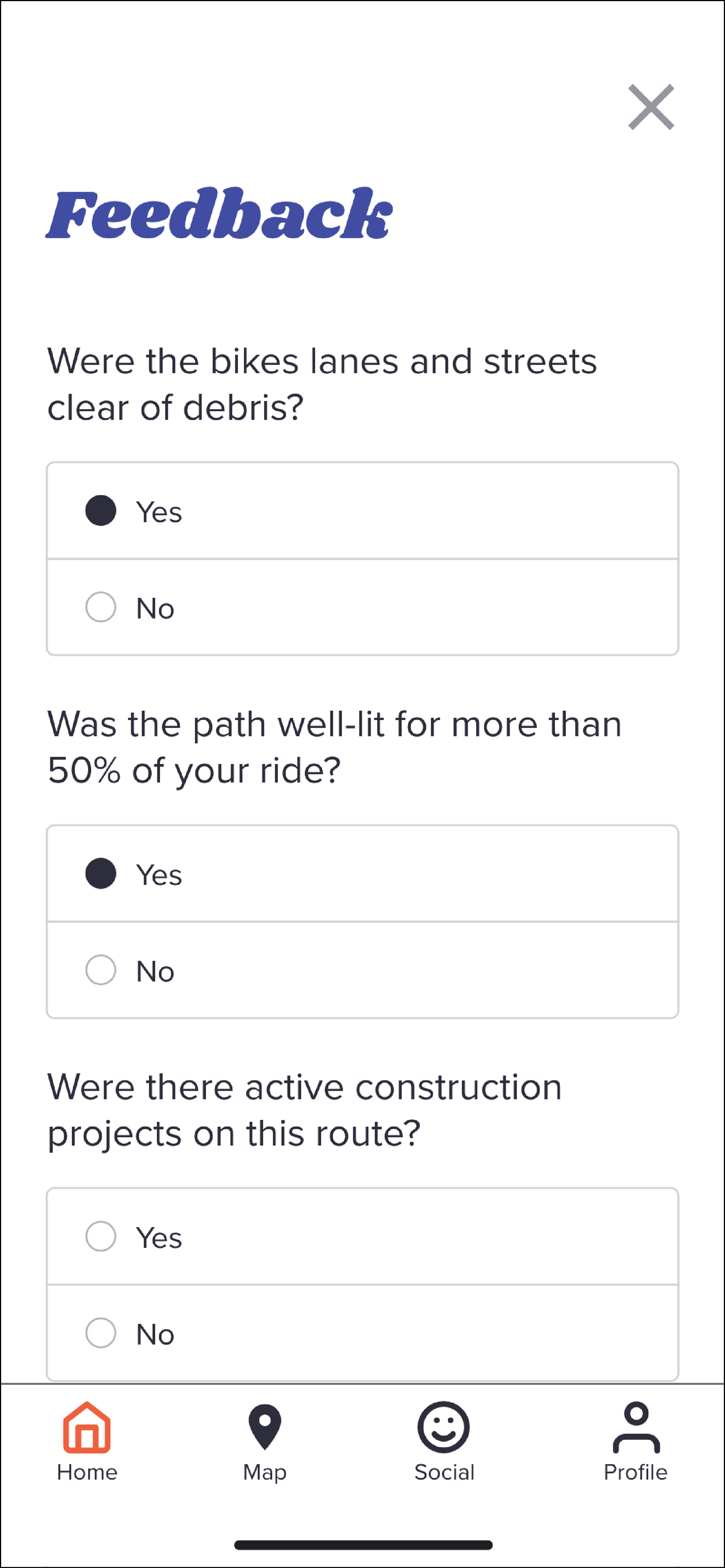
— map — navigation to/from destination
— user can give route feedback (ease of use as well as safety)
— route stats/route diary
— simple health stats
— user can give route feedback (ease of use as well as safety)
— route stats/route diary
— simple health stats
Design updates
Initial wireframes were changed following usability testing because:
— overall flow made sense but
— my nav bar needed text to help make sense of the icons and
— some of those icons were misleading
— my nav bar needed text to help make sense of the icons and
— some of those icons were misleading
Solution: small tweaks to flow and improvements to icons and content strategy.
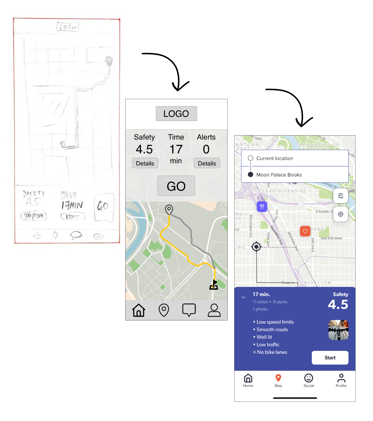
An evolution from sketched lo-fi wireframes to the final prototype

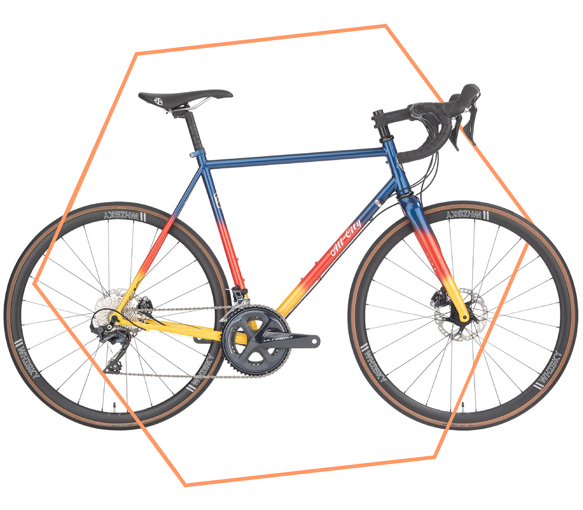
All-City bicycle
Branding
Inspired by the hometown heroes at All-City, the app color palette and typography is retro with a fun twist—just like biking.
Colors were chosen to maximize accessibility and legibility, while UI elements promote ease of use and few distractions so users can keep focus where it matters: on the road and enjoying the ride.
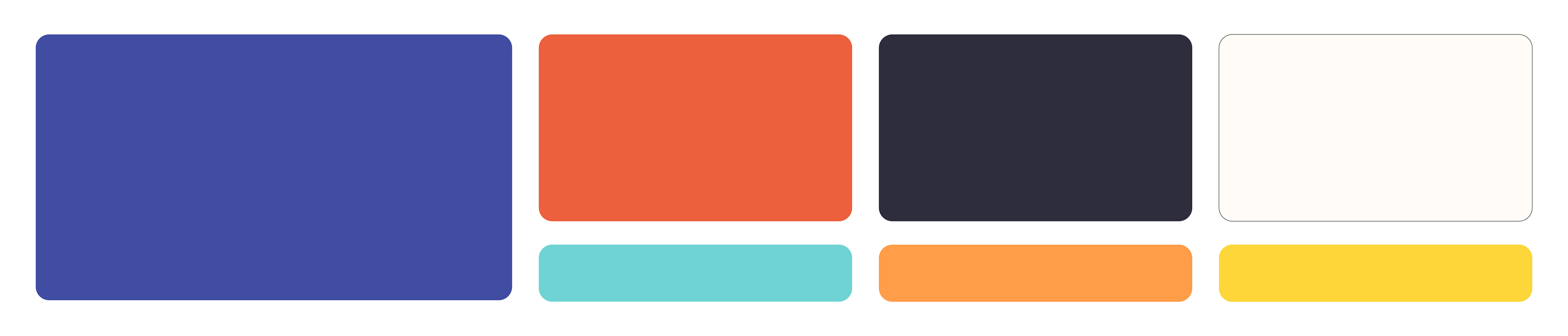
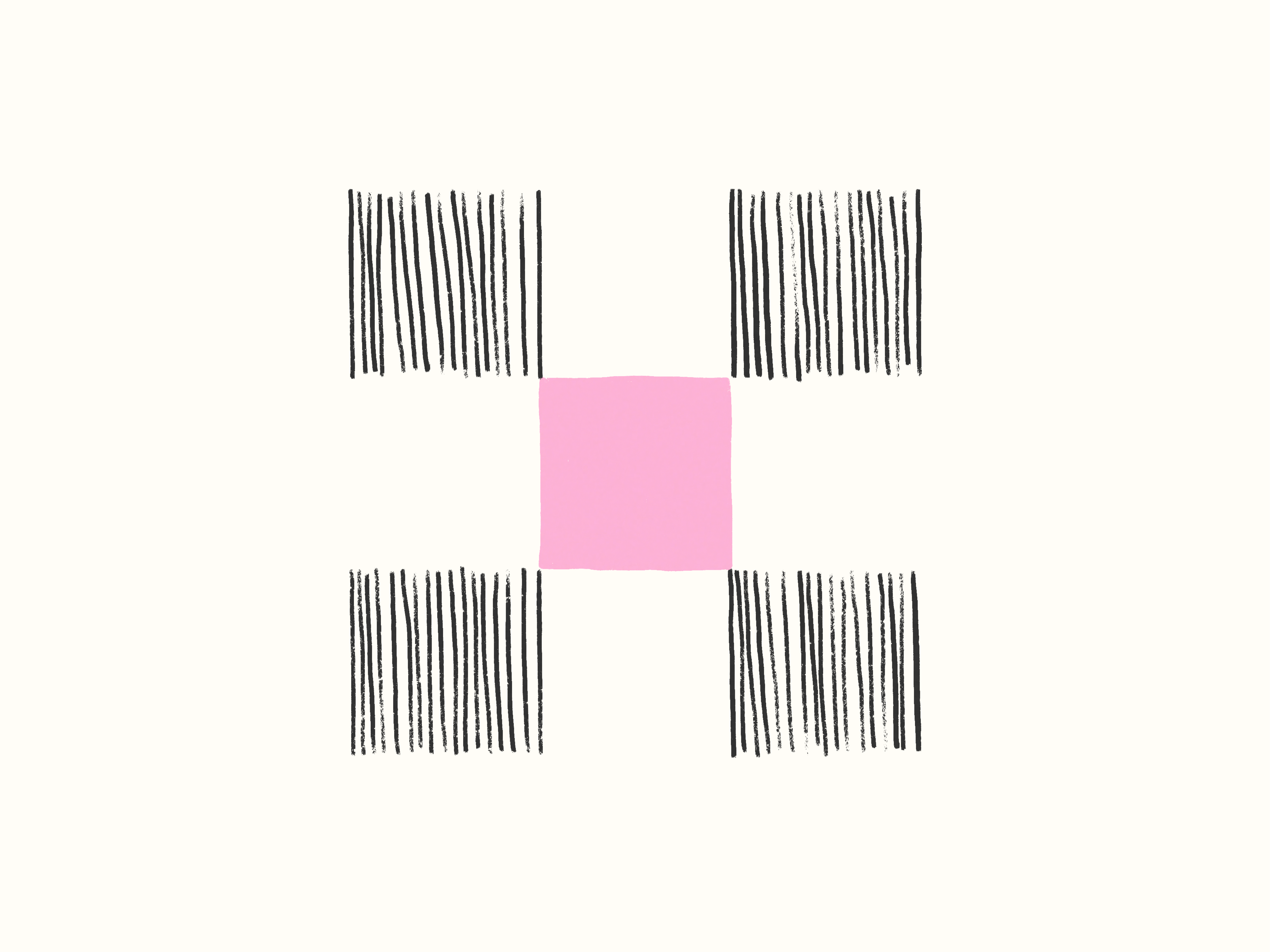
Color palette blocks

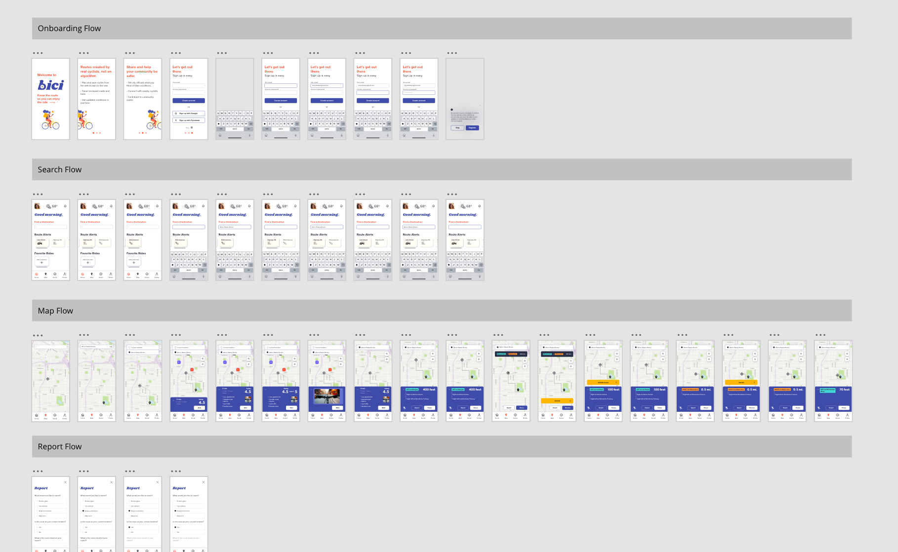
Image of bici wireframes in Adobe XD
What's next?
The work is never done, and neither is the ride.
Planned improvements include
— more safety categories to choose from
— incentive for users to share feedback
— road previews with users who enable recording while they ride
— route filters for safety preferences, type of ride (commute, fun), time, and distance
— city officials feedback: email your reps directly if something is seriously unsafe or you have ideas for new bike paths
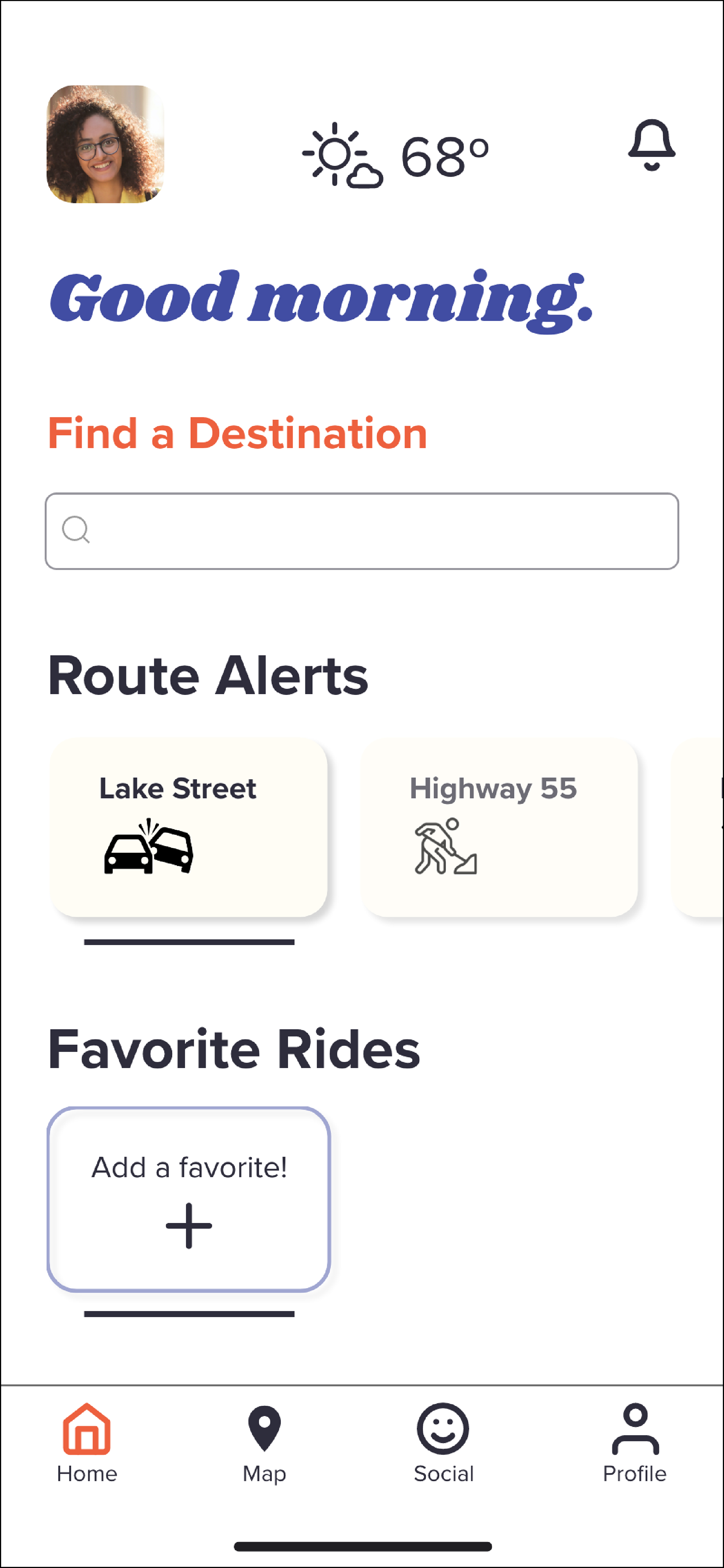
Final search screen example
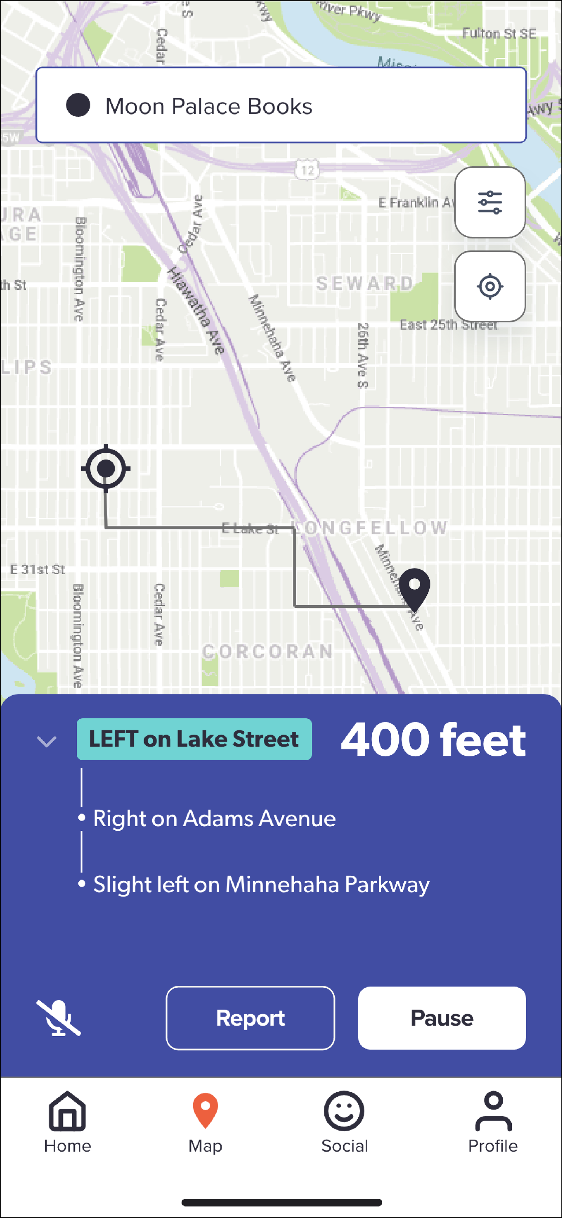
Final route screen example
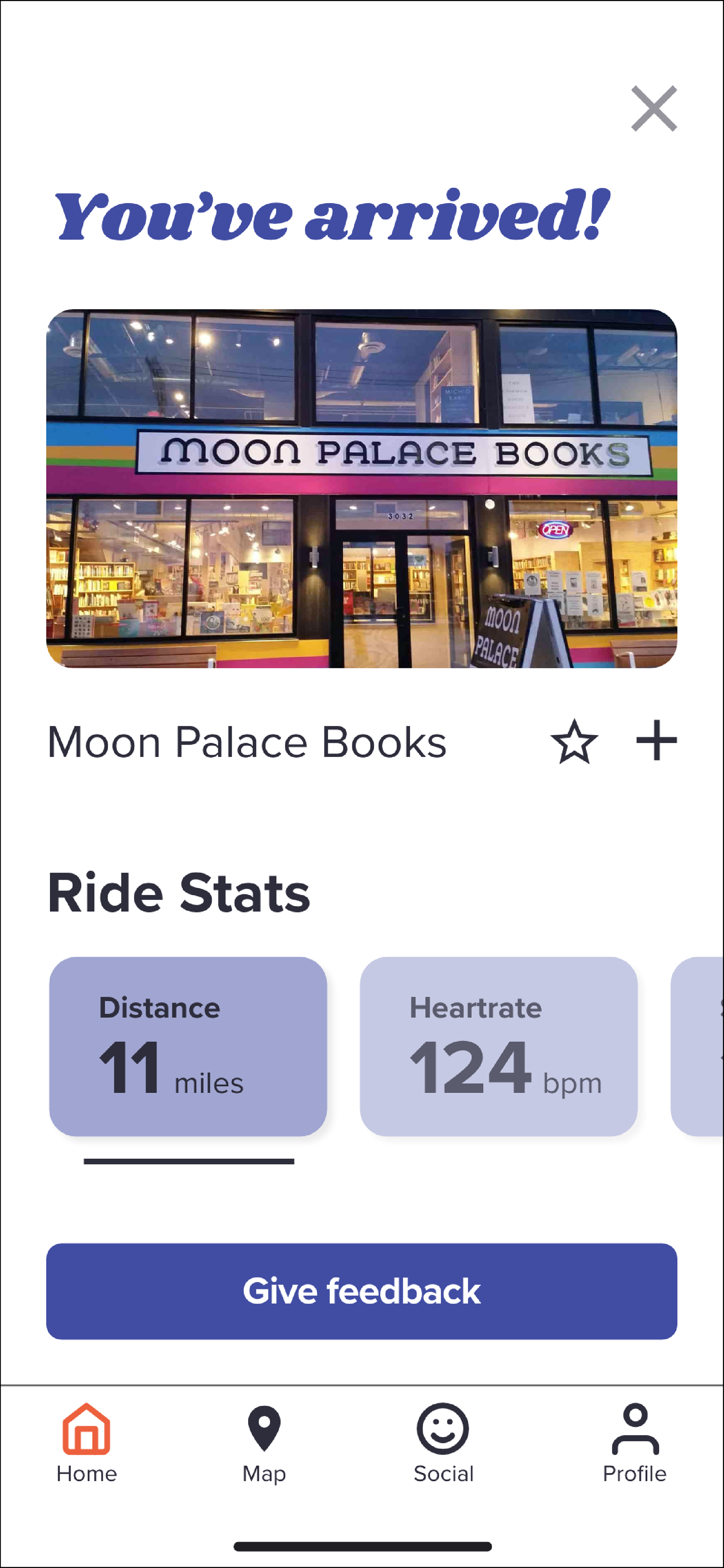
Final arrival screen example